complex
Creating a panelGridLayout or tableLayout structure
It may be tempting to go crazy with panelGroupLayout components in ADF Faces and ADF Mobile. The panelGroupLayout is not the universal hammer. In many cases, you will have a simpler structure (easier to maintain, more predictable, faster performing, more flexible) if you build your structure using a panelGridLayout or tableLayout instead.

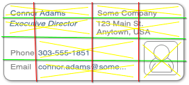
When you are given a mock-up of what the application should look like, you may not know how to break it down into something simple. Either print out the design on a piece of paper or open it up in a graphics program where you can draw some lines.
- Draw vertical lines representing potential column divisions (red)
- Draw horizontal lines for potential row divisions (green)
- Now that you have a basic grid structure, use a different color (yellow) to draw x marks where you see cells that need to span multiple columns or rows:

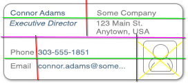
- You may find that your column lines really don’t make sense (in this case, the 2 middle columns had no cells in them that didn’t need to span into a nearby column. This is an indication that there probably ought to be 2 separate grids or tables. Use a new color (magenta) to draw a line where the division makes sense and repeat the process again:

Now you can go back to coding your gridRow/gridCell or rowLayout/cellFormat components because you can visually see where the content goes and where you need to use a special columnSpan or rowSpan. As an added bonus, you now have the ability to specify the sizes for your cells as well as the horizontal and vertical alignments of your cells–something panelGroupLayout would not allow you to control.
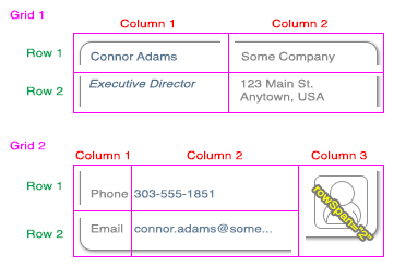
Notice that the labels and fields of grid 2 (columns 1 and 2) are showing separate components. This is done so that there can be matching horizontal alignment among the fields of the two rows. If these were input or select components, you would need to use simple=”true” (to hide the built-in label) and then use separate outputLabel components that reference them.
While we are only using consecutive grids in the example discussed in this article. You might come across a need to nest a grid inside of another grid. Do not excessively nest panelGridLayout nor tableLayout components (if you have 3 or more deep, consider a re-evaluation of your structure). You may find it helpful if someone else reviews your structure. Your goal should be to create something simple.
 Matt Cooper’s Weblog